Our goal in this blog is to explain what a Pareto Chart is, why it’s useful to manufacturers, and how it’s used within manufacturing analytics to help identify and fix problems on the factory floor. We’ll also use a specific example from a Mingo dashboard to show how you can use data gathered from a bottling line to find bottlenecks. For that example, scroll to the end of the blog.
To recap, we’ll cover:
- What are quality tools in manufacturing?
- What is a Pareto Chart and what is it used for?
- Are a Pareto Chart and Pareto Analysis the same thing?
- Real-life example: Find a bottleneck on a line using a Pareto Chart.
Quality Tools
Measuring and evaluating quality on the factory floor is vital to each and every manufacturer. It doesn’t matter what products you make or how you make them. Quality is a vital metric. For years, quality experts have relied on 7 tools to determine the quality of a product and ensure quality control.
- Cause-and-effect diagram
- Check sheet
- Control sheet
- Histogram
- Pareto Chart
- Scatter diagram
- Stratification
The most popular of those tools is the Pareto Chart. It’s a visual graphing tool used by all manufacturers to evaluate and provide quality improvement on the floor.
Pareto Chart: A Pareto Chart is a type of graph that “contains both bars and a line graph, where individual values are presented in descending order by bars, and the cumulative total is represented by a line.” Source: Wikipedia
The Pareto Chart has many names and is also commonly referred to as a Pareto Analysis or Pareto Diagram. This type of chart is useful in manufacturing for recording downtime and scrap reasons as well as finding bottlenecks on production lines. Often, manufacturers find out about underproduction and downtime too late, but the Pareto Chart can help to fix this problem.
There are many other uses for the chart in other industries, but for the sake of this blog, we’ll keep it limited to the manufacturing industry.
The History of the Pareto Principle
For a little bit of history, the Pareto Chart was developed by Italian economist Vilfred Pareto in 1897 to represent the uneven distribution of wealth. He believed that 80% of the wealth was controlled by 20% of the population. The development of the 80/20 rule eventually transformed into the Pareto Principle we know today. This principle attributes 80% of problems caused by 20% of factors.
Years later, this chart became synonymous with manufacturing due to its ability to easily highlight the top causes of defects and bottlenecks.
What is a Pareto Chart Used For?
The purpose of the Pareto Chart is to visually illustrate the most important factors of a particular issue.
In the world of manufacturing, a Pareto is often used to highlight downtime and scrap reasons and bottlenecks on the line. As shown in the example below, you can see how the chart highlights specific reasons for downtime: end of shift cleaning, shortstop, dial-in, tool change, and changeover. Downtime reasons are on the horizontal axis while how many of those downtime events occurred is found on the vertical axis.
Using the chart you can analyze the causes of downtime on the factory floor and determine a course of action for fixing the problems.
With manufacturing analytics software, one of the key benefits is being able to easily display aggregate data. This provides a trend analysis. When that data is collected and contextualized, it will be displayed automatically in a Pareto Chart, in real-time. This gives you the ability to view data in context in a way that makes sense.
With Mingo, you will easily be able to analyze machine downtime and determine how to correct problems and improve processes.
Pareto Analysis
Simply another name for a Pareto Chart, a Pareto Analysis helps identify common causes of persisting issues. Let’s take a minute to dive even further into how this chart, or analysis, can impact manufacturing:
- Identify key causes of problems, whether that is downtime, scrap, or even bottlenecks
- Discuss the problems during your daily production meeting
- Organize a plan of action using the identified causes
- Improve productivity, efficiency, and profitability
So, how do you create Pareto Analysis to reflect the data gathered from your own shop floor?
How to Make a Pareto Chart to Identify Bottlenecks
Traditionally, creating a Pareto Chart was a manual process. You would physically write out a list of problems, write out the root causes of problems, score the problem, group by score, then and create a line and bar chart. Tedious, right?
After you had manually created a chart, you could identify which of the root causes of problems followed the 80/20 principle. Of the 80% of problems, what was the 20% causing those?
Luckily, technology has come a long way. You don’t need to draw out a chart by hand. Using the data gathered from a manufacturing analytics software like Mingo, a Pareto Chart is created for you, with just a few clicks, using real-time data from the floor. This significantly reduces the amount of time spent creating the chart manually. Instead, this provides more time for value-added work. You can see at a glance what’s going wrong on the floor, too. This is a huge project benefit.
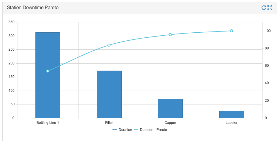
Let’s go through an example of how to use a Pareto Chart to identify bottlenecks on the line. Below, you’ll see a chart from the bottling line dashboard. (Remember, no manual work on your part – this is created for you within Mingo.)

The horizontal axis lists the stations in the line that experienced downtime. The vertical axis shows how often those downtime events occurred. The line graph indicates how long these downtime events lasted.
After looking at the chart, you can see the beginning of a bottleneck in either the station or the line as a whole. Something is happening that takes the line down and creates a bottleneck, ceasing production further down the line. You can see most of the downtime is related to the whole bottling line, but there are clear problems at the filler, too.
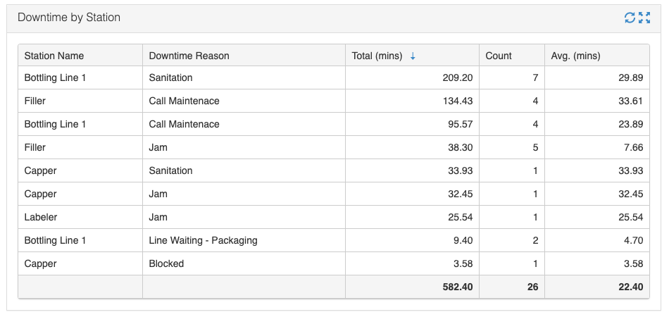
To supplement data, below is a screenshot of specific downtime reasons which represents the cumulative of where downtime occurred and why. Sorting by total minutes, you’ll see sanitation on the line is the number 1 reason for downtime. However, sanitation is required each time there is a changeover on the line so there’s nothing you can do about that particular downtime reason. On to the next downtime problem.
If you look at the next line in the graph, you’ll see that “call maintenance” on the filler and the bottling line as a whole are top downtime reasons. This indicates a problem that needs to be addressed.

The chart is helping you figure out where the largest percentage of downtime is coming from, with additional reasoning data.
In this specific example, there is an issue with the filler that needs your attention. Go out and view the filler. Watch what’s going on. Talk to maintenance about their findings, and discuss the machine with your operators. This would be a good time to start the “5 Why’s” process to determine the root cause of the problem.
A Pareto Chart Helps Manufacturers Determine Root Cause
Manufacturing analytics software will help you collect information from the line and showcase the problem areas. When those problem areas are highlighted, you can gather insights and take corrective actions.
It may not seem like it now, but the benefits of this type of chart trickle down the organization. When you’re able to find, analyze, and correct problems, you will produce a better product. When there is a better product, there is less scrap. Less scrap means the correct number of products will be packaged and delivered to your customer. And, in the end, this provides better customer service. Think of it like a waterfall. Everything you do at the top benefits the bottom.
The Pareto Chart is a simple, yet effective visual tool for determining the root cause of problems, downtime, scrap, or bottlenecking. Using the graph, organizations can quickly create a plan of action in tackling problems.
Additional Pareto Chart Resources
- PDCA: Plan, Do, Check Act – PDCA is another quality tool that helps to organize and improve processes.
- The DAMAIC Process – This is another tool or methodology that helps to improve processes in 5 steps.
- Lean vs. Six Sigma – What’s the Difference? – This blog outlines the differences between two very popular improvement methodologies, Lean and Six Sigma.


